This tutorial includes accessibility fundamentals to help make all your digital content accessible. The goal is to create an equitable learning experience for all students, giving them an equitable opportunity to succeed in your course.
The Accessibility Fundamentals in this Tutorial:
- Alternative Text for Images
- Headings
- Descriptive Links
- Contrast & Color
- Data Tables
- Accessibility Checkers
- Conclusion
Alternative Text for Images
Images meant to convey meaning should contain an alternative or “alt” text description. When a student using a screen reader encounters an image, their screen reader reads the description for them.

Simple Instructions:
- In Office documents, right-click the image and choose “View Alt Text” from the menu. This opens the “Alt Text” panel.
- If your image conveys meaning and a description won’t make your content redundant, insert a succinct description.
- Otherwise, click the “Mark as decorative” checkbox.
- For all non-decorative images, you must set the Layout to “In Line with Text”.
- Click the “Layout Options” button next to the selected image and set it to “In Line with Text”.
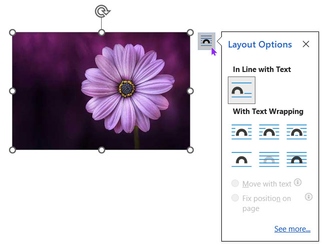
- Click the “Layout Options” button next to the selected image and set it to “In Line with Text”.

In-Depth Instructions:
See our How to Create Accessible Images tutorial for more details and to learn about decorative images. In addition to the tutorial, there are many writing alt text resources available.
Headings
Headings are essential to Word (and most other) documents because they give the document structure. This hierarchical structure allows students to scan and navigate the document visually or with assistive technology, like a screen reader.
But this only works if headings are set properly (as styles) and if the hierarchy is well formed.
Tips for Creating Accessible Headings
- Use Heading 1, Heading 2, Heading 3, etc. styles already created in Word (on the Home tab).
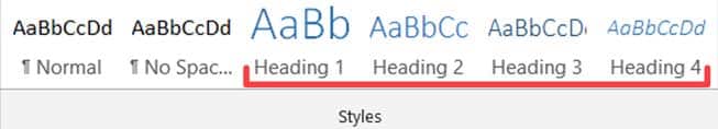
Word’s Heading Styles in the Home Ribbon - Create a well-formed heading hierarchy for your document.
- Use the Heading 1 style once per document or webpage.
- Don’t skip heading levels (e.g., from a Heading 1 to a Heading 3).
- Open the Navigation Pane (View > Navigation Pane) while you work on an Office document’s headings. Consequently, you’ll be more likely to notice empty headings and skipped heading levels.

In-Depth Instructions:
For more details, check out our How to Create Accessible Headings tutorial. (Or, go directly to our well-formed heading hierarchy example.)
Descriptive Links
Links should:
- Be descriptive and meaningful out of context
- Help people know where they’re going
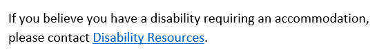
Descriptive links give meaning to where the URL in the background will take you. You’ve seen several descriptive links already throughout this guide (and yet, no URLs).
Screen reader and keyboard-only users can skip from link to link by pressing the Tab key on their keyboard. Or they could access them as a list of links in the document. Therefore, if links don’t make sense on their own, we’re not providing enough information.
Simple Instructions:
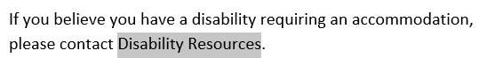
- Select the text you want to link.
Selecting text in a Word Document - Press Ctrl + K (Cmd + K for Mac) to Insert Hyperlink. (Or right-click and select “Link” in the drop-down menu.)
- Choose “Existing File or Web Page,” and paste a URL into the Address textbox.
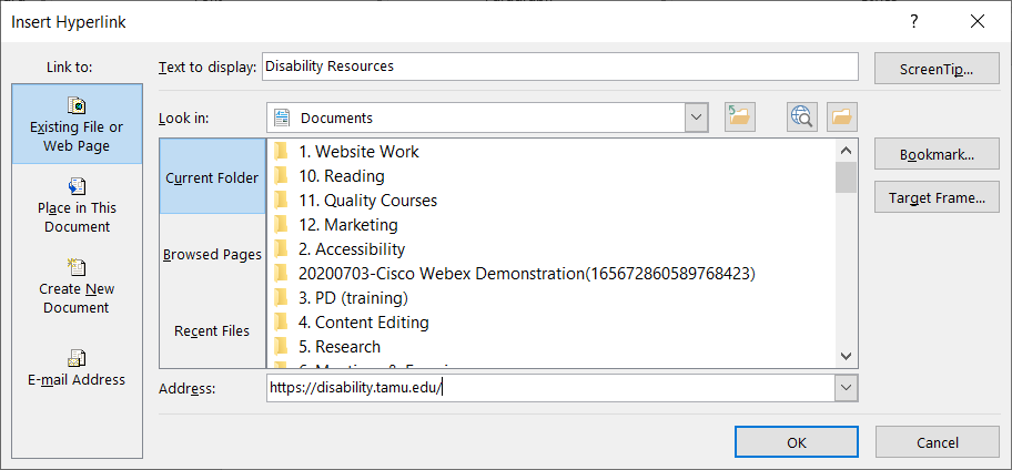
Insert Hyperlink Dialog Window - Press Enter or click OK to create the link. The result should look similar to this:
Hyperlink Result

In-Depth Instructions:
See our How to Create Accessible Links tutorial, where we discuss good and bad hyperlink examples. WebAIM has more to say about links and screen readers, helping you form better descriptive link text.
Contrast & Color
Contrast
So all students can read your content without difficulty, the text and its background color should have sufficient contrast. Be aware of color combinations that may be problematic for students with color blindness (like red and green).

The highest and best possible contrast is black text on a white background or the opposite (contrast ratio: 21:1). The worst contrast example shown here is off-white text on a white background (contrast ratio: 1.12:1).
Additional tools can help you find better colors to use in your digital content. Check out Just Color Picker (or any other eyedropper tool) and WebAIM’s Contrast Checker to help you find good combinations. You may only need to darken your text to find a better contrast ratio.
Use of Color
In-Depth Instructions:
See our Contrast & Color Accessibility tutorial for more details.
Data Tables
Data tables display information in a grid or matrix. They contain header columns and/or rows that explain what the information in the grid means.
Sighted students can scan tables to make associations between table data and corresponding headers. When you set table properties correctly, table headers provide those associations for students using a screen reader.
In-Depth Instructions:
You must associate table headers with the data in your table to make a table accessible. Adobe Acrobat Pro and Canvas will flag your document for an inaccessible table otherwise.
Please read How to Create Accessible Tables for detailed instructions on how to set up tables correctly (in Word).
Accessibility Checkers
Office products typically have an internal automated accessibility checker. This checker can help you find and fix many accessibility issues within your documents.
However, automated accessibility checkers can only find so many issues (about 30%). Hence, we should follow the guidelines seen throughout this accessibility fundamentals tutorial. Adhering to these guidelines and using the accessibility checker together helps ensure you create accessible documents for your students.
See how to use Word’s Accessibility Checker.
Conclusion
There are many things you can do to increase the accessibility of your digital content.
If this seems overwhelming at first, don’t worry. Eventually, you even won’t need to look at this list; it will just come naturally. At that point, you’ll know you have fully embedded accessibility into every document you create. (You just need some practice.)

Leave a Reply