In this tutorial, you’ll learn how color and contrast can improve the accessibility of documents, presentations, and web pages.
Page Contents
The Definition of Contrast
Contrast is a measure of the difference in perceived “luminance” or brightness between two colors.
This brightness difference is expressed as a ratio ranging from 1:1 (e.g., white text on white background) to 21:1 (e.g., black text on white background).
Accessibility Guidelines for Contrast & Color
Based on Web Content Accessibility Guidelines (WCAG) 2.1 Level AA:
- Contrast Ratio between text and its background must be:
- 4.5:1 for normal (body) text (Contrast Minimum)
- 3:1 for large text
- Never use color alone to present content or instructions. (Use of Color)
Contrast Examples
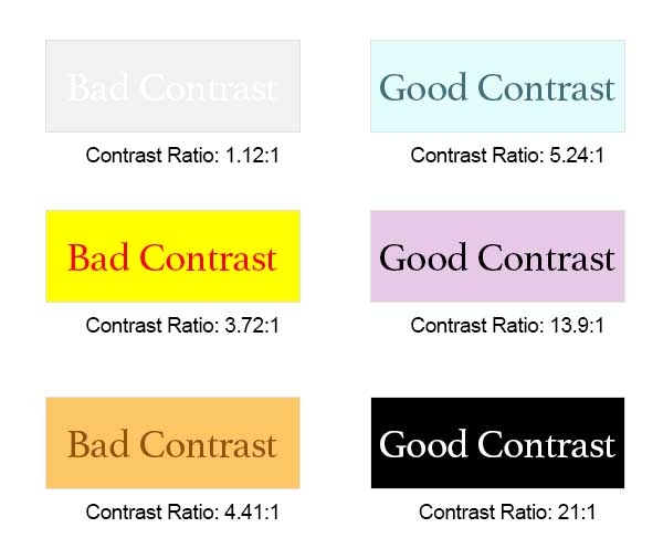
You may think eyeballing your text and its background color is enough to ensure sufficient contrast. However, the lack of contrast between some colors may surprise you.
Here are some good and bad examples of contrast, along with their contrast ratios.

WebAIM’s Contrast Checker
WebAIM’s Contrast Checker is a great tool to help you determine if your text and its background color have a high enough contrast to meet Level AA compliance.
Please note: WebAIM’s Contrast Checker calculates contrast ratio based on Hex values entered for text and background colors. Just Color Picker is a great tool to grab Hex color values from anywhere on your screen, so you can enter that value into the contrast checker.
Just Color Picker shouldn’t require an install, but please contact Engr-HelpDesk@tamu.edu if you need assistance getting this program onto your machine.
Textual content should have the highest contrast ratio possible, so students can do their best in your course.
Don’t Use Color Alone
Never use color alone to present content or instructions. Add something extra, like a character or style, so students can tell there is something different about this particular content.
Example 1: Links/Hyperlinks
Links are a simple example of this concept. Links are typically blue and underlined. However, not everyone can see the color blue. This is why we add a secondary indicator that the content is a link: the underline.
Example 2: Pie Charts
Pie charts (and other graphs) are also a great example to explore. Sometimes, you see pie charts split apart with many different colors. But the more colors used, the more they start to blend together.
For example, in this London Ethnicities pie chart, can you tell which blue segments are Bangladeshi, Indian, Pakistani, and Other?

Adding textures (like varying dots and lines) to your pie segments makes them much easier to differentiate. It is also beneficial to add labels pointing to each segment rather than using a key or legend with each color and its corresponding label.
Black & White Copies and Printouts
Think about how often charts are printed (or copied) to black and white. This monochrome version must still allow your students to understand your chart. Some students may actually see all your content in shades of gray if they have a particular type of colorblindness. (Though this is admittedly rare.) However, black-and-white printouts or copies are much more prevalent due to the cost of colored ink.
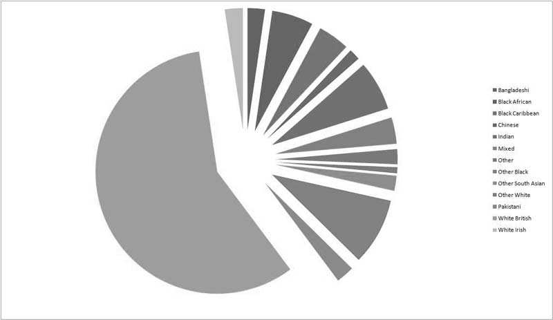
The chart below (Figure 3) is the same chart seen in Figure 2 but with a black-and-white filter.

The chart in Figure 3 gives students no indication of what label goes with which segment. Adding texture and labels would make this chart readable again.
A Good (Black & White) Pie Chart Example
The chart below (Figure 4) illustrates what needs to happen when a chart goes monochrome. Even though this chart rarely uses textures, and many segments look identical, we know what they are due to their labels.

Conclusion
Accessing content should never be a barrier between your students and their education. This is why we must ensure colors have sufficient contrast and extra indicators exist to convey something is different about this content or information.

Leave a Reply