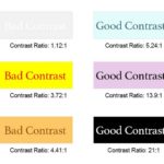
Contrast is a measure of the difference in perceived “luminance” or brightness between two colors.
This brightness difference is expressed as a ratio ranging from 1:1 (e.g., white text on white background) to 21:1 (e.g., black text on white background).
Learn some contrast and color accessibility guidelines and how to ensure you’re using colors all your students can see when creating documents.
Continue Reading


